
When several products become one brand, how do you make them feel like one experience?
Students shouldn't need to understand a company's acquisition history to check their progress or log a skill.
We defined a clear, opinionated north-star vision for a unified student experience — and delivered the tactical design guidance to start moving toward it immediately.
Portico is an end-to-end student platform bringing attendance, skills tracking, payments, and academic progress together under a single brand. Its capabilities grew through consolidation — which meant students were navigating multiple web portals and mobile apps with overlapping functionality, inconsistent navigation, and different visual languages.
As the company began selling a true end-to-end solution, a fragmented student experience became a strategic risk. Schools needed a reliable channel to reach and activate students; students needed one clear place to understand where they stand and what comes next.
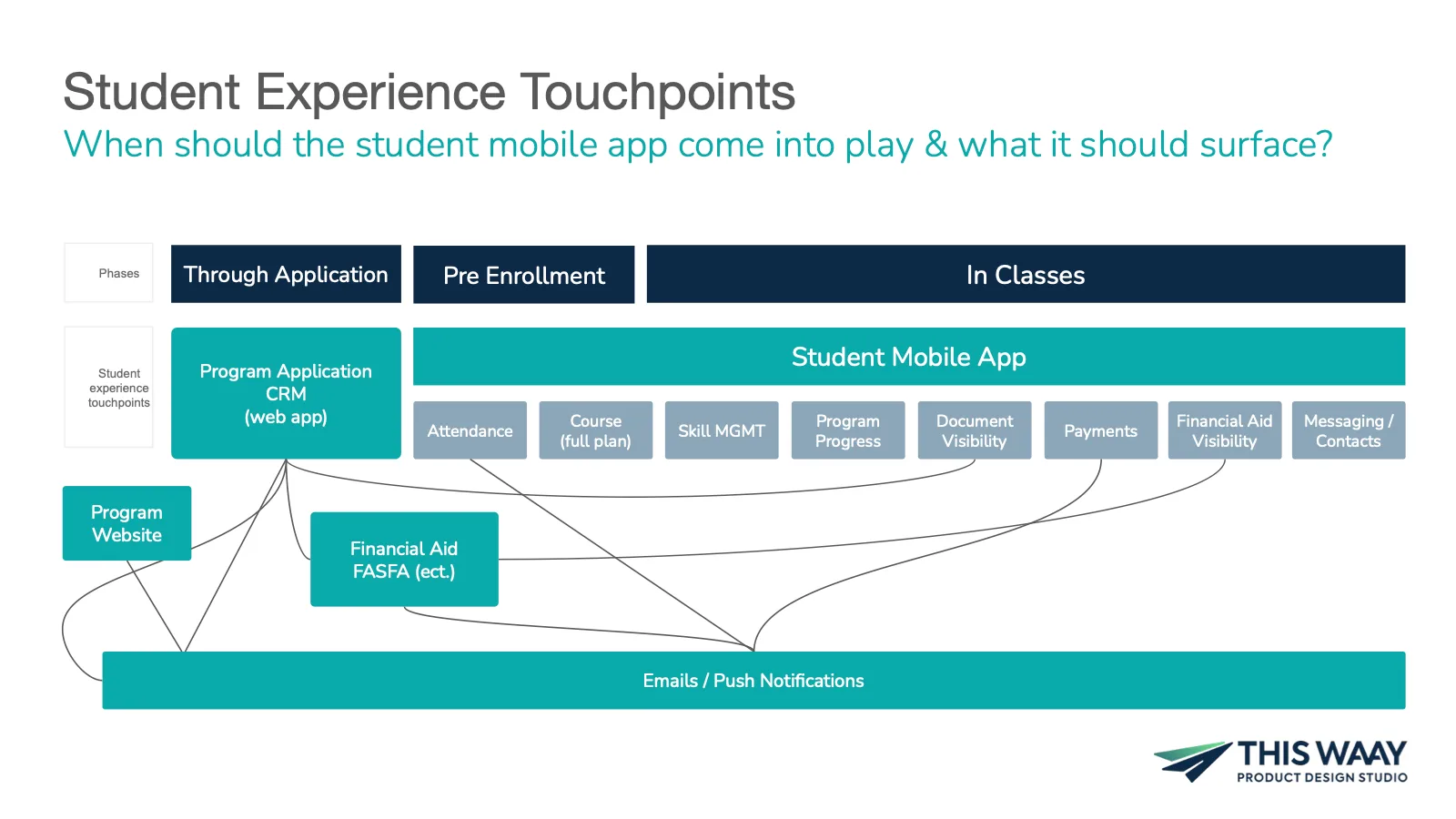
Over eight weeks, we evaluated the student experience across every platform in the suite, modeled the full student journey from application through graduation, and designed a branded north-star concept for a single unified mobile experience — paired with tactical guidance for the quarter's roadmap.
We partnered with the cross-functional product team to define how the student journey should flow — from first login to academic completion — delivering both a north-star vision and the near-term design guidance to unify the experience milestone by milestone.
A student's journey touched four student-facing web portals and two mobile apps — each with its own login, navigation, and conventions. Core needs were scattered: skills lived in one product, attendance in another, grades and program progress in a third.
Every extra portal was another place for a student to get lost — and another support ticket for a school.
The fragmentation created problems on both sides of the platform:
The company knew the end state it wanted: one mobile app, one web portal, one cohesive design. What it needed was an opinionated definition of that experience — and a realistic first milestone to build toward.
The challenge was to turn a portfolio of acquired tools into one coherent journey, without waiting for a multi-year replatform.
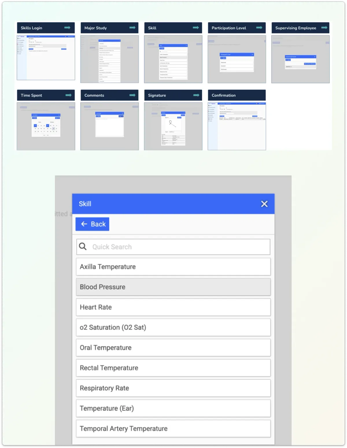
We walked the journey the way a new student would — from registration emails to logging their first skill.
We conducted a heuristic evaluation across every student-facing platform in the suite, focused on three themes that mattered most for the coming year: the first-time user experience, skill logging and approval, and progress visibility across attendance, grades, and program completion.
The evaluation surfaced sharply different strengths across products — friendly, well-guided onboarding in one app; rich progress data buried in another; multi-step workflows that relied on administrator intervention in a third.
We synthesized those findings into artifacts the team could align around:
That recommendation — anchoring on the strongest existing app rather than starting from scratch — became the backbone of the design phase.
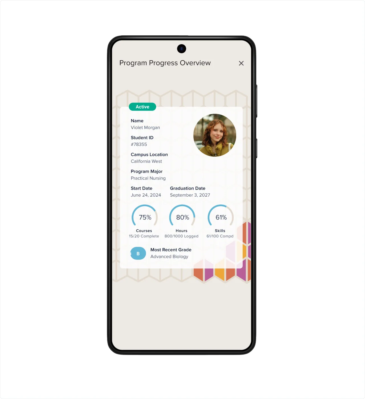
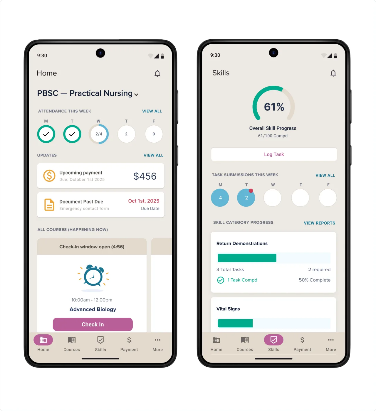
One app. One navigation. One answer to "how am I doing?"
The north-star concept brought the unified experience to life across eight areas of investment: refreshed branding, a dynamic landing page, scalable navigation, skill management enhancements, program progress visibility, unified messaging, gamified engagement, and an AI accelerator.
Key design decisions shaped the concept:
The full concept was delivered as a clickable prototype in the refreshed Portico brand, giving the team a tangible target to sell internally and build toward.
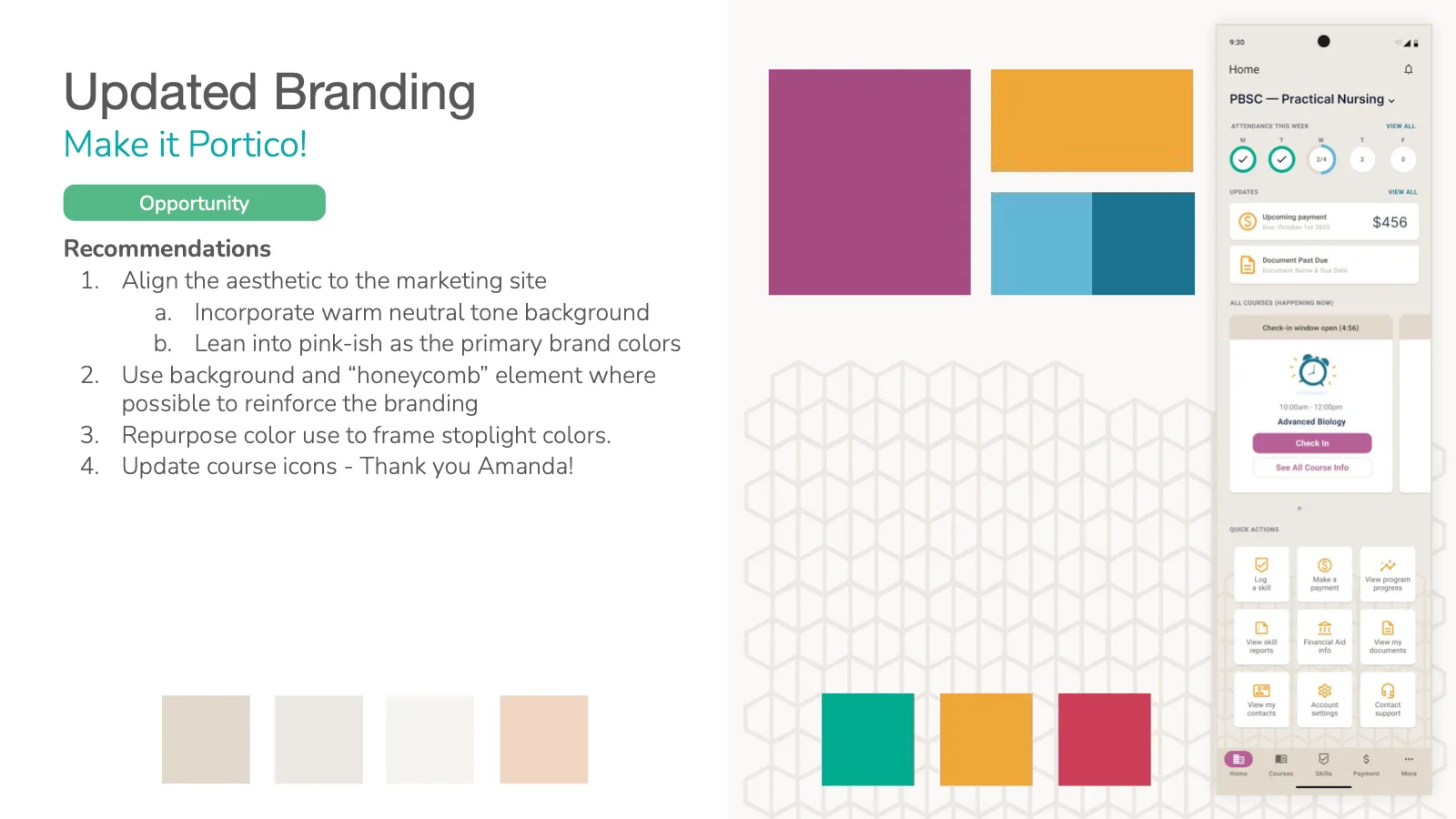
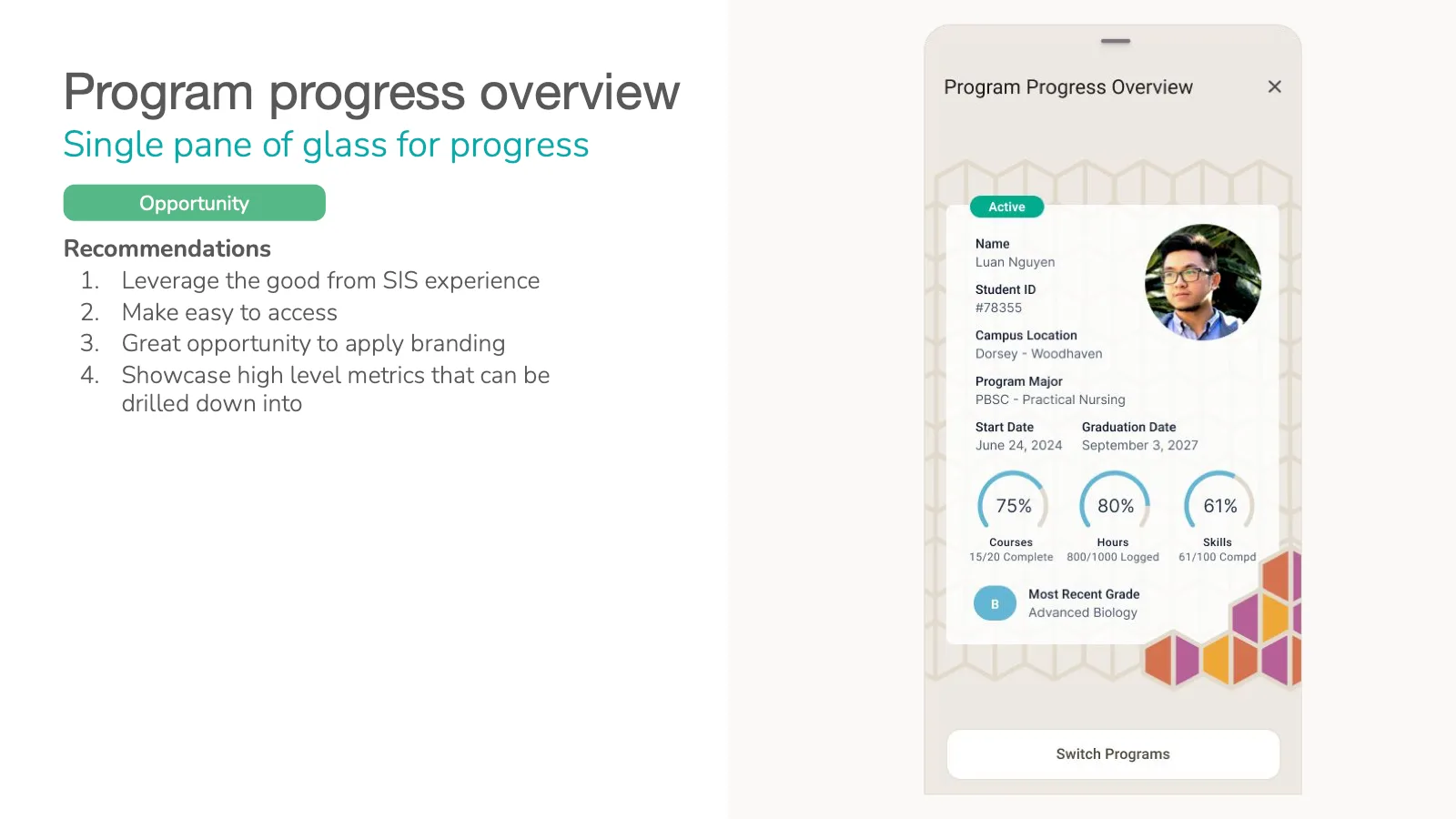
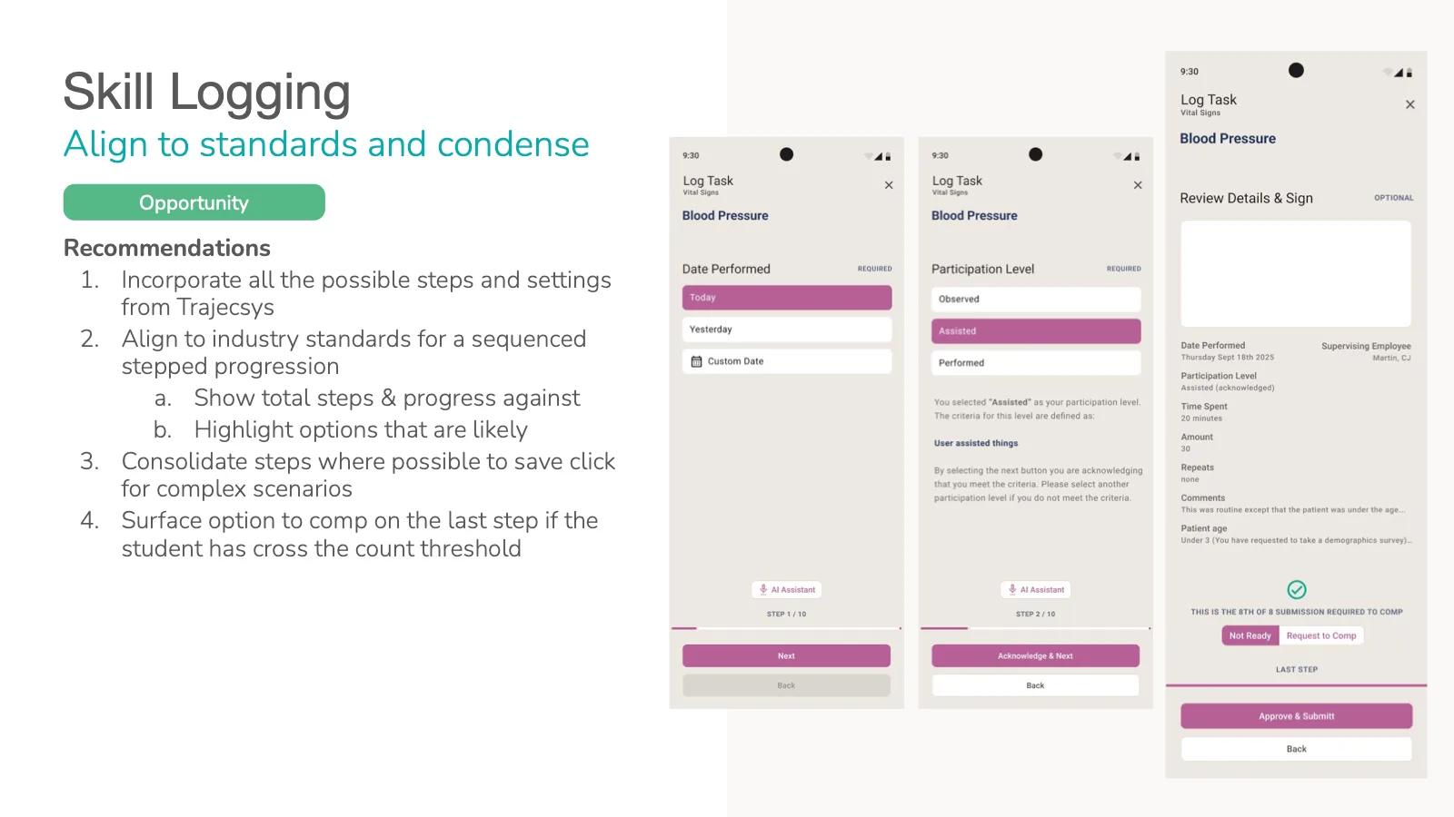
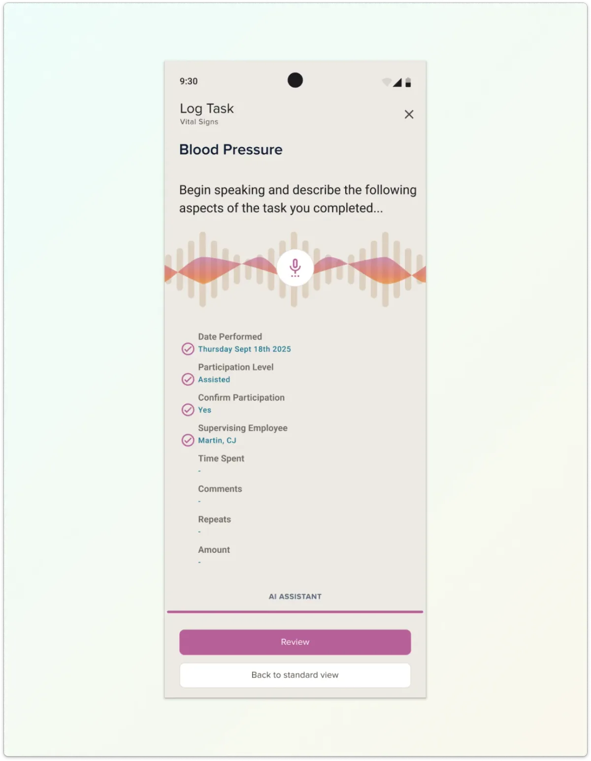
The team left with more than a vision — they left with a sequenced path from four portals and two apps toward one experience.
The engagement's outputs were structured to be actionable at three horizons:
Because the vision anchored on the strongest existing product, progress didn't depend on a risky rebuild — each milestone delivered student value on its own.
The skill logging work also surfaced a clear opportunity for intelligent acceleration. How we approached workflow friction ahead of AI investment is explored in depth in our AI case study: reducing workflow friction before scaling AI.
Acquisitions unite companies on paper long before they unite experiences in practice.
When products consolidate under one brand, the gap between the promise ("one platform") and the reality (many logins, many navigations) lands directly on users — and on the support teams behind them.
Without a defined north star, consolidation efforts drift into familiar traps:
An opinionated experience vision — grounded in an honest evaluation of what each product does well — turns consolidation from a branding exercise into a compounding product advantage. Every roadmap decision gets easier when everyone can see where the journey is headed.

See how reducing workflow friction creates the clarity and structure required for effective AI adoption.
Click to learn moreMixed-methods research that separated usability problems from value problems — and set product direction.
Click to learn moreAn iOS-standard redesign that removed a hardware dependency and opened App Store distribution.
Click to learn moreDiscovery and redesign that unified a fragmented media experience across web and mobile.
Click to learn moreIf your platform is consolidating tools, brands, or acquisitions, we’d love to help you define the unified experience your users deserve — and a milestone plan to get there.
Start a conversation