
What happens when an outdated UX doesn't just slow users down — it blocks an entire sales channel?
Ecolane's driver experience required dedicated hardware because it couldn't live in the iOS App Store.
We redesigned the app around familiar iOS patterns — removing the hardware dependency, reducing training needs, and giving the team a concrete concept to rally investment behind.
Ecolane, part of the Transit family, empowers transportation logistics for passengers with expanded needs. Its driver app is the daily workhorse of paratransit operations — the screen a driver relies on for every pickup, drop-off, and fare adjustment across a shift.
The existing experience had aged out of step with the platforms it ran on. It wasn't supported as a native iOS experience, which meant customers had to purchase dedicated hardware alongside their subscription — a real barrier in the sales conversation. And its bespoke interface patterns meant every new driver needed custom training.
We were engaged to redesign the key screens of the driver experience around iPadOS standards: a conceptual prototype strong enough to unlock App Store distribution, reduce training burden, and make the case internally for sustained design investment.
We led the UX evaluation and redesign — identifying the screens that mattered most, diagnosing the friction in each, and delivering a modern iOS concept the team could use to align stakeholders and advocate for dedicated design resources.
Drivers work in a demanding context: mounted tablets, moving vehicles, tight schedules, and passengers who depend on them. Every extra tap or ambiguous status indicator has a real operational cost.
The UX debt wasn't just a design problem — it was a business constraint.
The evaluation focused on the workflows drivers live in all day, where the friction was clearest:
Beyond the screens themselves, the platform gap defined the stakes: without an iOS-standard experience, the product couldn't reach the App Store, and customers couldn't use devices they already owned.
The challenge was to modernize the experience decisively — within a scope small enough to move fast, but complete enough to prove the path.
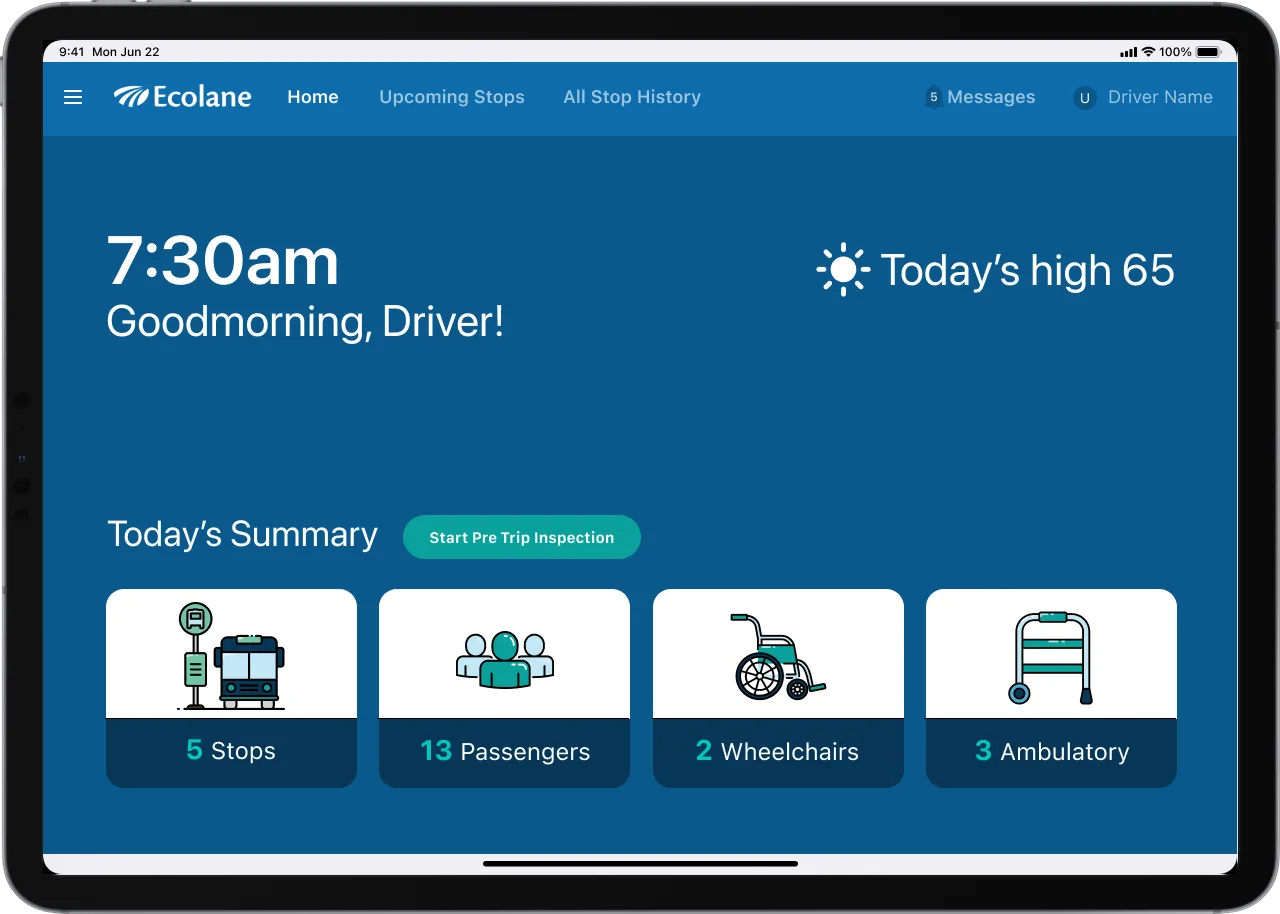
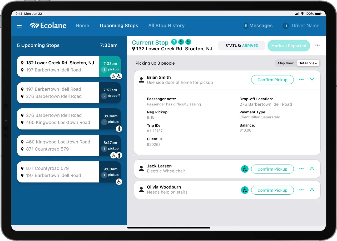
Not every screen needed a redesign. The ones drivers touch constantly did.
Rather than boiling the ocean, we identified the global elements and key workflow screens that would define the experience — navigation first, then the trip, passenger, and fare workflows that make up the bulk of a driver's day.
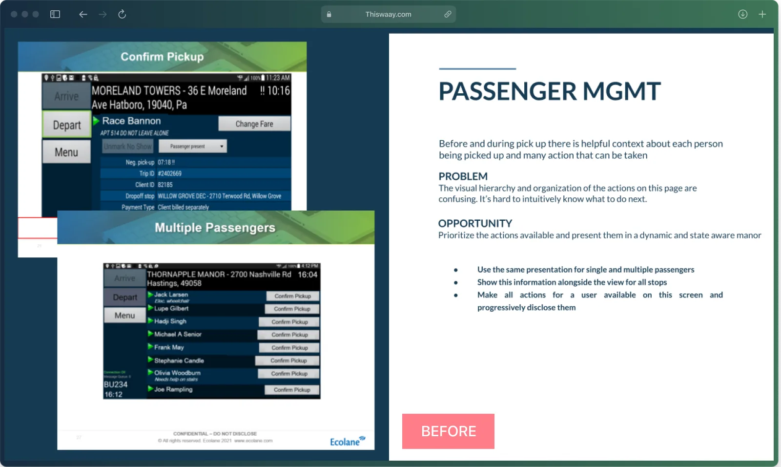
For each area we framed the problem and the opportunity in plain terms the whole team could align on:
Grounding every decision in ubiquitous iOS patterns served both goals at once: an experience drivers already know how to use, and a product that finally qualifies for the platform it runs on.
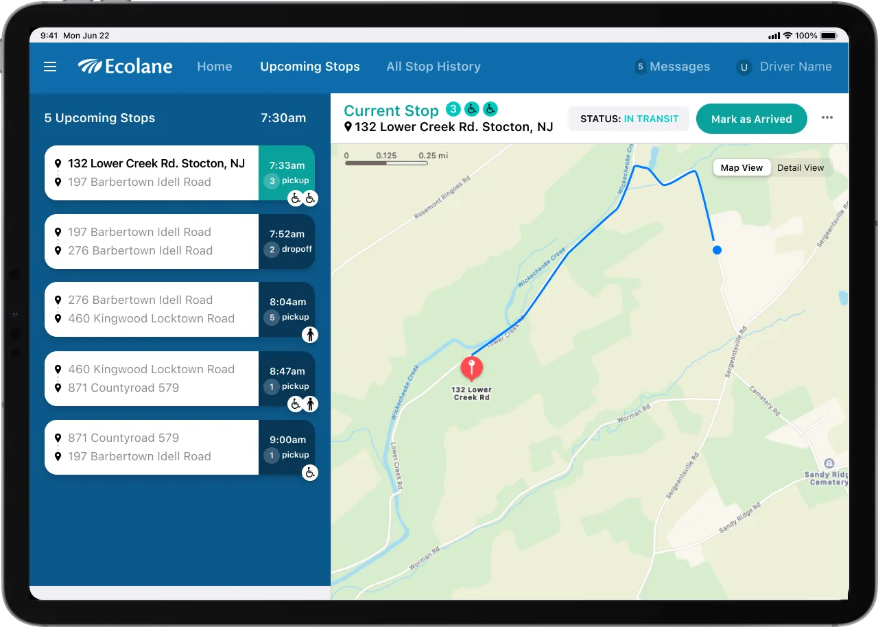
A driver's whole day on one screen: upcoming stops, current stop, live map, and every action within reach.
The redesigned experience reorganized the driver's world around a clear, persistent structure:
Fare and passenger editing moved to standard iOS components: full-page takeovers, the system keyboard, and clearly labeled fields with persistent navigation, so drivers always know where they are.
The before-and-after told the story instantly — the same operational power, presented with the clarity of a modern consumer app.
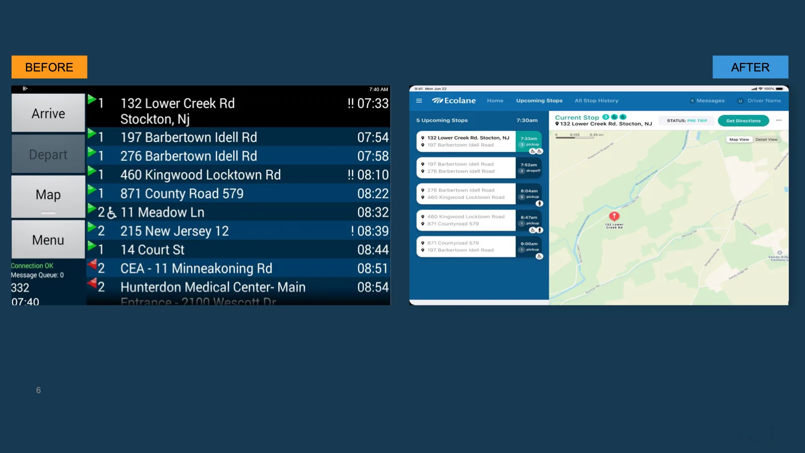
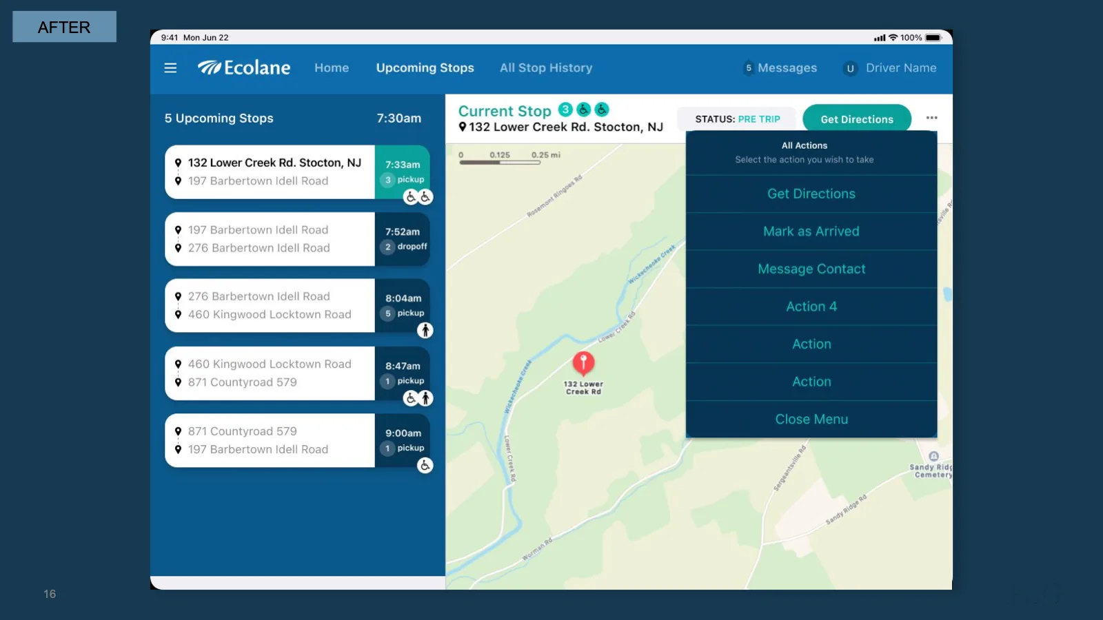
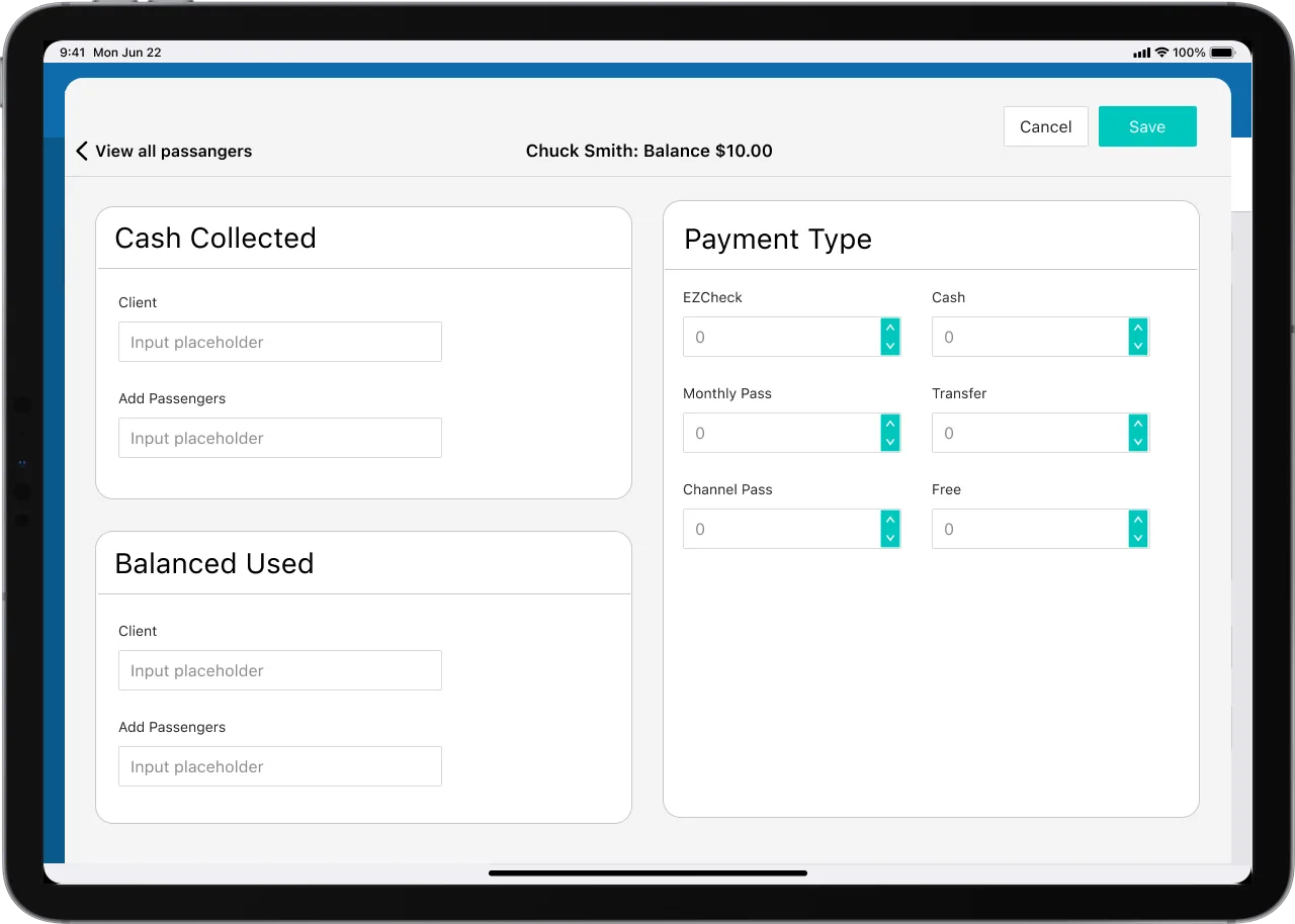
A focused design engagement changed what the product could be sold as — not just how it looked.
The concept delivered against both project goals:
For a product serving passengers with expanded needs, the stakes are bigger than convenience: clearer tools for drivers translate directly into more reliable service for the riders who depend on it.
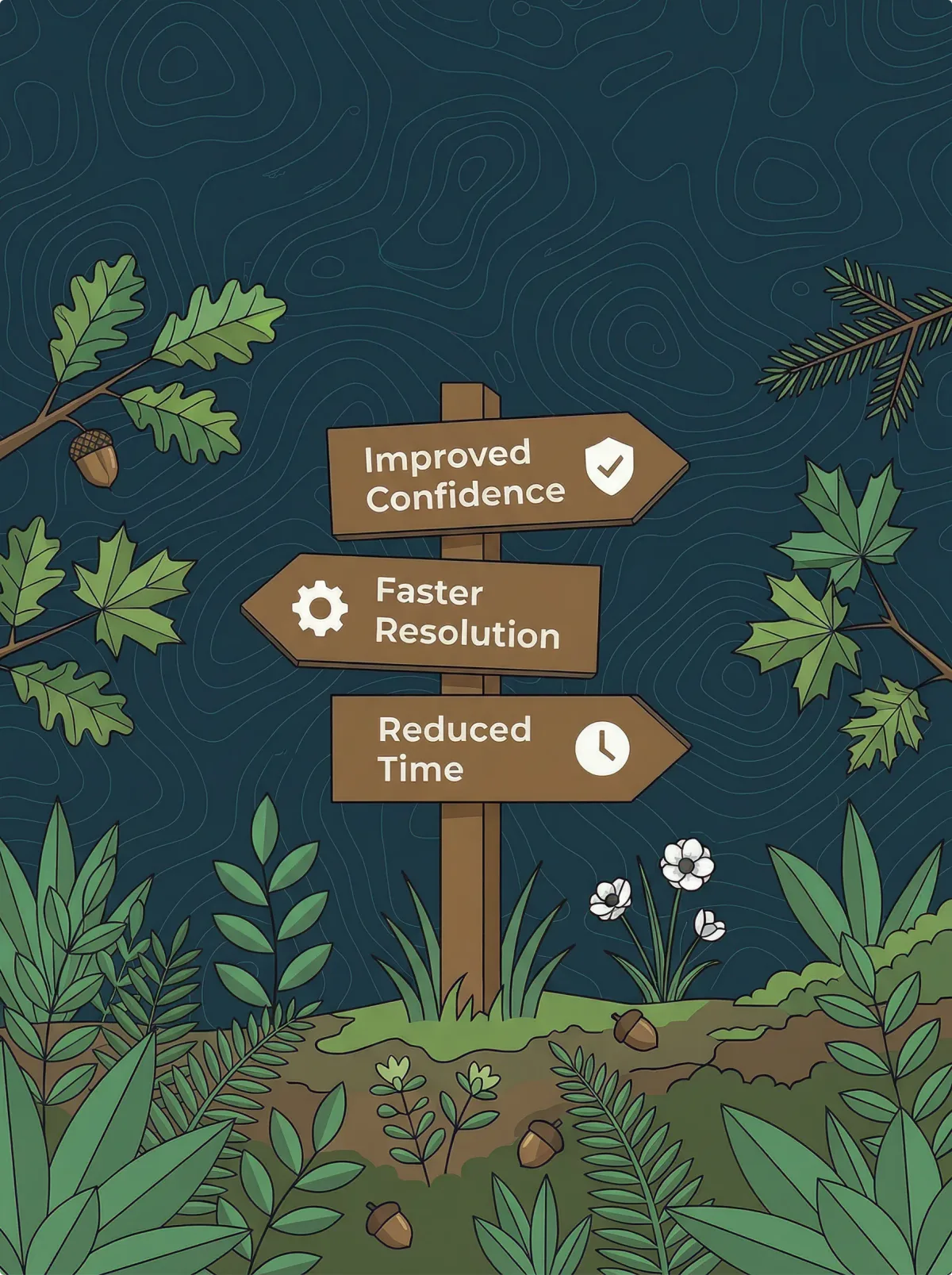
Sometimes the strongest business case for design is a door it unlocks — a market, a channel, a device your customers already own.
UX debt is usually discussed in terms of user frustration. But in products with aging foundations, it quietly accumulates into strategic constraints: platforms you can't ship to, hardware you're forced to bundle, training programs that exist only because the interface is unfamiliar.
A targeted redesign grounded in platform standards can convert those constraints into advantages:
You don't need to redesign everything to change the trajectory. You need to redesign the right things, well enough to prove the path.

Discovery and redesign that unified a fragmented media experience across web and mobile.
Click to learn moreUsing AI to surface meaningful signals while making outputs more understandable, traceable, and trustworthy.
Click to learn moreHow we found the highest-value UX improvements in a mission-critical automation platform — no rebuild required.
Click to learn moreSee how AI can improve clarity and decision-making in complex systems without compromising control or trust.
Click to learn moreIf an aging experience is constraining your sales, distribution, or onboarding, we’d love to help you design the concept that changes the conversation.
Start a conversation